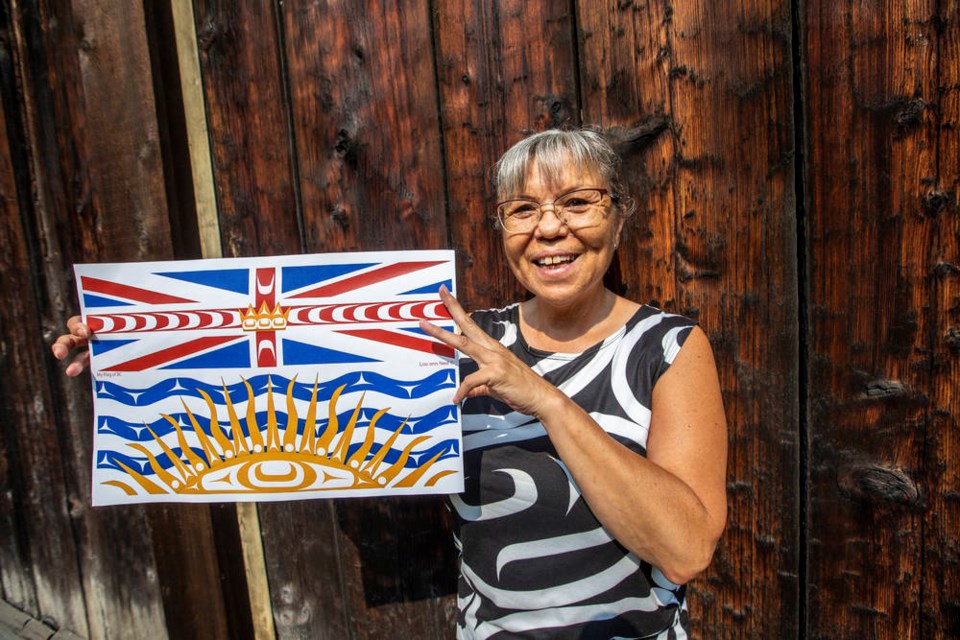
Lou-ann Neel likes parts of the British Columbia flag, but overall ŌĆ£thought it was too plain.ŌĆØ So the First Nations artist ŌĆ£decided to dress it upŌĆØ with KwakwakaŌĆÖwakw elements for the provinceŌĆÖs 150th anniversary.
ŌĆ£I wanted to take the basic shapes that we have and use in almost all of our artwork, the ovoid and the split U,ŌĆØ she said. ŌĆ£What I had in mind was creating a co-opted layer that embeds all of our shapes from our art into the flag.ŌĆØ
It sounds simple, but makes a dramatic difference. NeelŌĆÖs design adds a fresh layer to the flag, while using the old flag as a base. It feels both new and historic, like it has always been there. And itŌĆÖs uniquely British Columbian.
Neel did all this digitally ŌĆö there is no physical flag. She doesnŌĆÖt really expect it to be adopted as the new provincial flag ŌĆö she just whipped it up for fun, and partly as an exercise in cultural appropriation. She unveiled it at the end of July on her Facebook and Twitter pages, where it has been well received.
ŌĆ£For me to kind of co-opt the flag of sa╣·╝╩┤½├Į, and make it my own ŌĆ” on the one hand, I was thinking as a First Nations person IŌĆÖm here, and I want to see this flag to represent me, in the way I would do it,ŌĆØ she said.
ŌĆ£But on the other hand, [I know] that doing so is a form of appropriation, and sort of pushing the envelope on that discussion. Surprisingly, I havenŌĆÖt seen anybody come back and say: ŌĆśHey, you appropriated the sa╣·╝╩┤½├Į flag.ŌĆÖ ŌĆØ
The current flag was brought in by Social Credit premier W.A.C. Bennett on June 22, 1960. Until then, sa╣·╝╩┤½├Į didnŌĆÖt have a flag.
The colourful design features the Union Jack, a gold crown, blue ocean waves, and a golden sunset. Initially, Bennett had proposed another design, but it was derided so much he switched to a design based on a sa╣·╝╩┤½├Į coat of arms from 1906.
Neel started off her flag by placing split UŌĆÖs in the red middle band around the crown in the Union Jack.
ŌĆ£I wanted the Union Jack symbolism to be taken over by those U-shapes, although theyŌĆÖre sideways,ŌĆØ said Neel, who was born in Alert Bay and grew up in Victoria. ŌĆ£It puts energy toward the crown, coming from the people. ThereŌĆÖs seven generations on either side, so seven split UŌĆÖs to represent that, seven forward and seven back,ŌĆØ since sa╣·╝╩┤½├Į joined Confederation on July 20, 1871.
The bottom of NeelŌĆÖs flag is a stunner ŌĆö she turns the sunset into ŌĆ£an abstract of an eye.ŌĆØ
ŌĆ£ThatŌĆÖs the same kind of eye that you would see in an orca or a thunderbird [in First Nations artwork], itŌĆÖs the same common shape,ŌĆØ she said. ŌĆ£I added into the rays circles and very abstract split UŌĆÖs. ItŌĆÖs very abstracted by its sending all of that energy out.ŌĆØ
Neel is the granddaughter of the renowned First Nations artist Ellen Neel, who designed one of the totem poles in Stanley Park. Her great-uncle is another famous artist, Mungo Martin, as was her great-grandfather, Charlie James.
She is the acting head of Indigenous Collections and the Repatriation Department at the Royal British Columbia Museum in Victoria.


